Data visualization: matplotlib & seaborn
Basic plots
import numpy as np
import matplotlib.pyplot as plt
import seaborn as sns
# inline plot (for jupyter)
%matplotlib inline
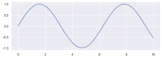
plt.figure(figsize=(9, 3))
x = np.linspace(0, 10, 50)
sinus = np.sin(x)
plt.plot(x, sinus)
plt.show()
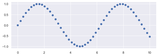
plt.figure(figsize=(9, 3))

plt.plot(x, sinus, "o")
plt.show()
# use plt.plot to get color / marker abbreviations
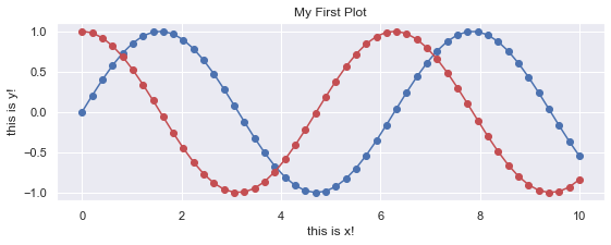
# Rapid multiplot

plt.figure(figsize=(9, 3))
cosinus = np.cos(x)
plt.plot(x, sinus, "-b", x, sinus, "ob", x, cosinus, "-r", x, cosinus, "or")
plt.xlabel('this is x!')
plt.ylabel('this is y!')
plt.title('My First Plot')
plt.show()
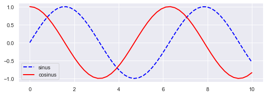
# Step by step

plt.figure(figsize=(9, 3))
plt.plot(x, sinus, label='sinus', color='blue', linestyle='--', linewidth=2)
plt.plot(x, cosinus, label='cosinus', color='red', linestyle='-', linewidth=2)
plt.legend()
plt.show()
Scatter (2D) plots
Load dataset
import pandas as pd
try:
    salary = pd.read_csv("../datasets/salary_table.csv")
except:
    url = 'https://github.com/duchesnay/pystatsml/raw/master/datasets/salary_table.csv'
    salary = pd.read_csv(url)

df = salary
print(df.head())
   salary  experience education management
0   13876           1  Bachelor          Y
1   11608           1      Ph.D          N
2   18701           1      Ph.D          Y
3   11283           1    Master          N
4   11767           1      Ph.D          N
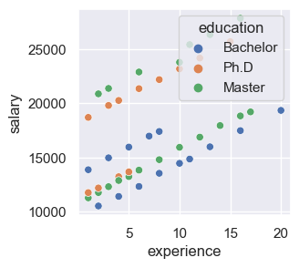
Simple scatter with colors
plt.figure(figsize=(3, 3), dpi=100)
_ = sns.scatterplot(x="experience", y="salary", hue="education", data=salary)
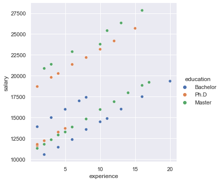
Legend outside
ax = sns.relplot(x="experience", y="salary", hue="education", data=salary)
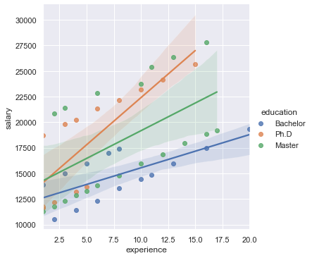
Linear model
ax = sns.lmplot(x="experience", y="salary", hue="education", data=salary)
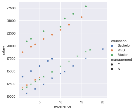
Scatter plot with colors and symbols
ax = sns.relplot(x="experience", y="salary", hue="education", style='management', data=salary)
Saving Figures
### bitmap format
plt.plot(x, sinus)
plt.savefig("sinus.png")
plt.close()

# Prefer vectorial format (SVG: Scalable Vector Graphics) can be edited with
# Inkscape, Adobe Illustrator, Blender, etc.
plt.plot(x, sinus)
plt.savefig("sinus.svg")
plt.close()

# Or pdf
plt.plot(x, sinus)
plt.savefig("sinus.pdf")
plt.close()
Boxplot and violin plot: one factor
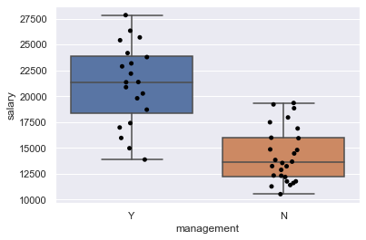
Box plots are non-parametric: they display variation in samples of a statistical population without making any assumptions of the underlying statistical distribution.
ax = sns.boxplot(x="management", y="salary", data=salary)
ax = sns.stripplot(x="management", y="salary", data=salary, jitter=True, color="black")
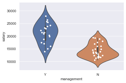
ax = sns.violinplot(x="management", y="salary", data=salary)
ax = sns.stripplot(x="management", y="salary", data=salary, jitter=True, color="white")
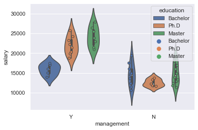
Boxplot and violin plot: two factors
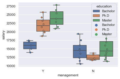
ax = sns.boxplot(x="management", y="salary", hue="education", data=salary)
ax = sns.stripplot(x="management", y="salary", hue="education", data=salary, jitter=True, dodge=True, linewidth=1)
ax = sns.violinplot(x="management", y="salary", hue="education", data=salary)
ax = sns.stripplot(x="management", y="salary", hue="education", data=salary, jitter=True, dodge=True, linewidth=1)
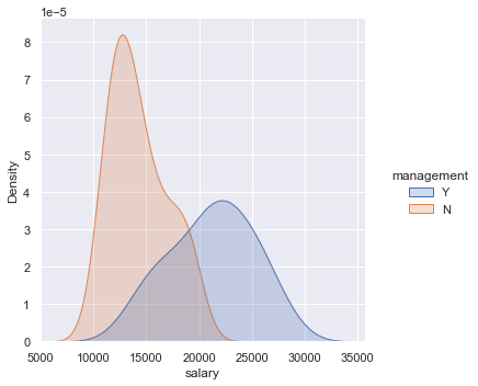
Distributions and density plot
ax = sns.displot(x="salary", hue="management", kind="kde", data=salary, fill=True)
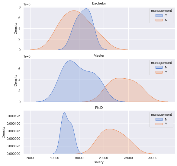
Multiple axis
fig, axes = plt.subplots(3, 1, figsize=(9, 9), sharex=True)

i = 0
for edu, d in salary.groupby(['education']):
    sns.kdeplot(x="salary", hue="management", data=d, fill=True, ax=axes[i], palette="muted")
    axes[i].set_title(edu)
    i += 1
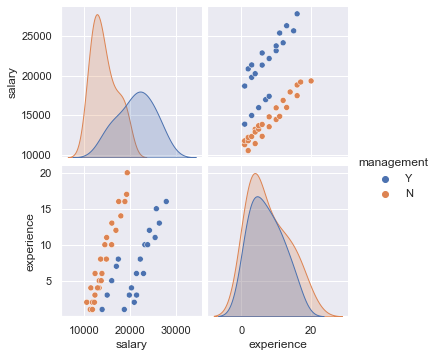
Pairwise scatter plots
ax = sns.pairplot(salary, hue="management")
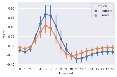
Time series
import seaborn as sns
sns.set(style="darkgrid")

# Load an example dataset with long-form data
fmri = sns.load_dataset("fmri")

# Plot the responses for different events and regions
ax = sns.pointplot(x="timepoint", y="signal",
             hue="region", style="event",
             data=fmri)